
Colors come into virtually all writing. For many if not most of us, we’ve been doing this based on instinct and personal experience. But I believe we could be better writers if we are more intentional in our color choices. Psychological and marketing research has uncovered a wealth of information about the impact of color. Here are just a few ways you can use this information.
Color the environment.
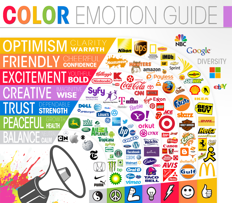
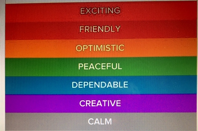
Every scene is set somewhere. By consulting the Color Emotion Guide, you can set up a room, a house, a car, etc., to help your readers perceive the emotion you want to convey. Some research has concluded that black has both positive and negative associations: positive = sophistication, glamour, security, emotional safety, efficiency, and substance; negative = oppression, coldness, menace, and heaviness.
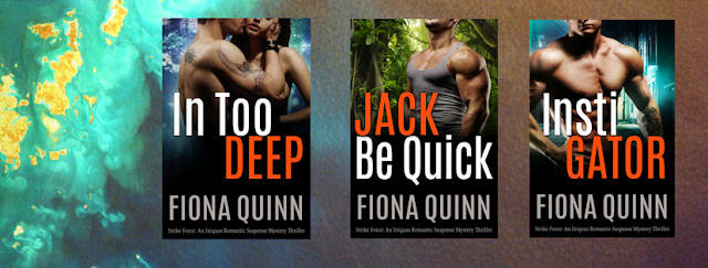
I recently noticed that in Fiona Quinn’s books that feature the Iniquus organization, she uses black, gray, and silver as the signature colors for the headquarters and work uniforms—which totally fits the “personality” of that organization. Writers, if your character owns a business, what is its personality?
Match your character’s personality with his/her clothing choices.
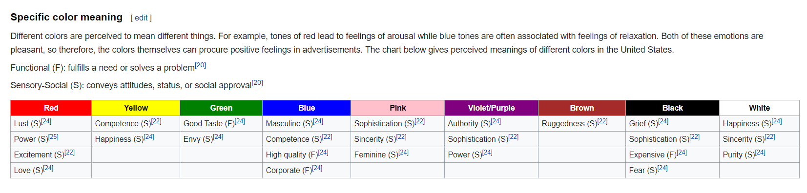
Psychological research has focused on 5 personality dimensions associated with color: sincerity, excitement, competence, sophistication, and ruggedness. Nearly every study on colors and branding concludes that it is far more important for colors to support the personality you want to portray instead of stereotypical images.
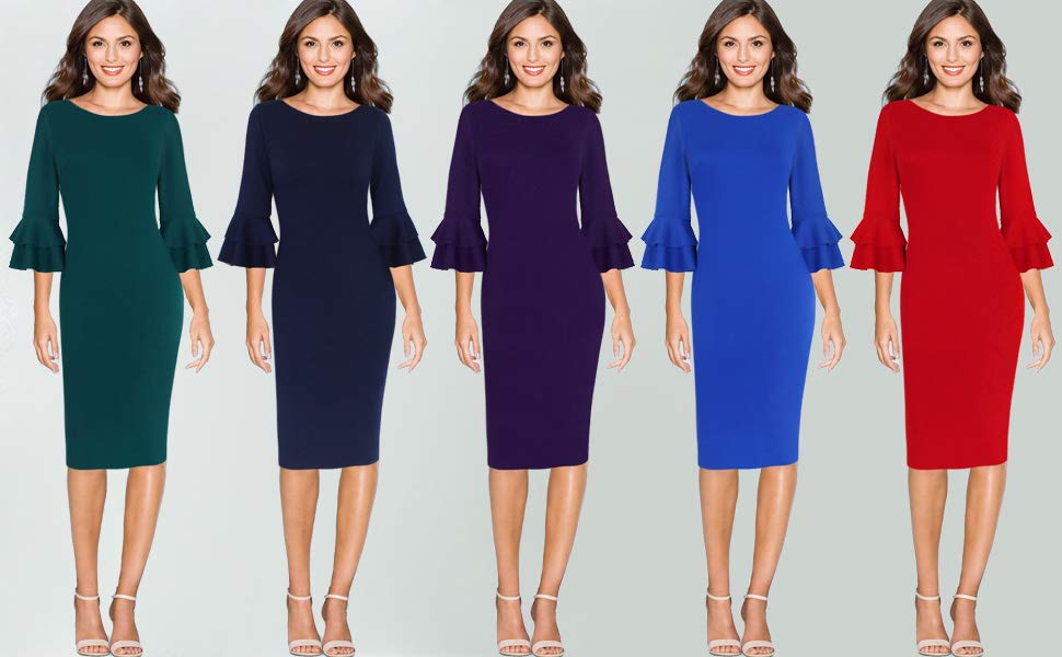
In general, men prefer bold colors and women prefer softer colors. Consider working outside the gender stereotypes.

What would be your inference if this sock drawer belonged to a woman? Would your inferences change if it belonged to a man? FYI: Variety seekers look for non-typical colors.
Use the Isolation Effect to enhance or obscure.

The Isolation Effect means that an item that stands out like a sore thumb is more likely to be remembered. Research clearly shows that people are able to recognize and recall something far better, whether it is text or an image, when it sticks out from its surroundings. Do you want your character/setting/object to be memorable or not? Of course you want your readers to remember a character when the book is done, but do you want other characters to remember him/her?
Color your language.
According to a study titled “A rose by any other name…” when people asked to evaluate products with different color names, such as makeup, fancy names were preferred far more often. For example, mocha was significantly more likable than brown, even when the color was the same. Bear in mind that unusual and unique color names are preferred for everything from jelly beans to sweatshirts. For example, crayons with names like razzmatazz were chosen more often than the ones with names like lemon yellow. Beware: As a writer, you want the reader to appreciate the language but you are also trying to paint a picture; labeling a dress or curtains razmatazz with no context is likely to take your reader out of the story.
BOTTOM LINE: You can use color to enhance your writing in numerous ways. CAVEAT: Generalities about color are based on group data, and if you really want to get specific, look for generalities by gender, age, and culture.
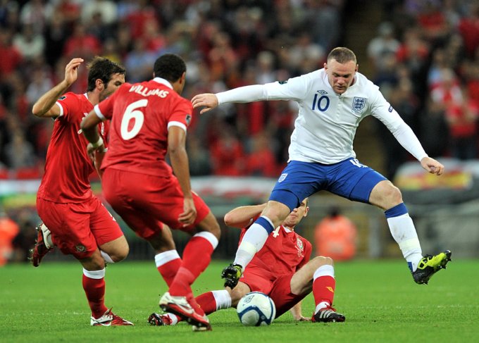
Fun fact in closing: When more or less evenly matched athletes compete, those wearing red are significantly more likely to win. And even when a videotaped competition is manipulated to make performance identical, competitors wearing red are given higher scores!